BRANDING - DESIGN
The flat design trend
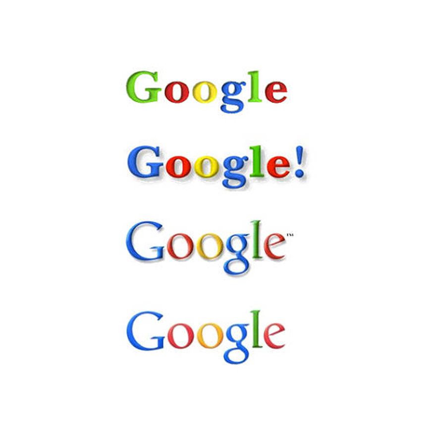
Flat design is big news in the creative world at the moment and today’s latest flat design trend has seen Google quietly (although not officially) release a logo that’s appeared in the latest Chrome build for Android.
This logo will only be used where the original logo doesn’t display well. However, there are suggestions that the logo was released by mistake - there’s been no confirmation or denial from Google.
It’s an interesting reworking of the logo and we’re keeping an eye out to see it appear elsewhere.
Another subtle flat re-design seen lately is from Yahoo. Yahoo says it has made a major change to its logo, but unless you have studied design it’s hard to tell the difference.
Yahoo's new logo
The design keeps many of Yahoo’s traditional logo elements. The colour scheme remains purple, the letters capitalised and, perhaps most important, the exclamation mark is still there.
But look closely and you'll see other parts of the logo are different - the logo no longer has those little tails (called serifs) at the end of each letter and each letter is thinner and taller than before.
Additionally, Yahoo went with a chiseled look for each letter, adding depth to its logo while most of the tech world has been gravitating toward so-called “flat” design in recent years.
We’ll keep our eyes peeled for others to follow this trend, but until then here’s a bit more about what’s behind flat design…
Flat design was a popular design concept many years ago, and it’s making a comeback.
Empowered by today’s developments in mobile, the flat design trend opposes more ‘elaborate’ design techniques in favour of a simplified, classically digital aesthetic. A minimalistic approach, flat design focus on emphasising usability – features are clean, open space, crisp edges, bright colours and two-dimensional/flat illustrations.
<<< Back to Blog